Kazo
Client: KAZO
Job Scope: Brand Identity
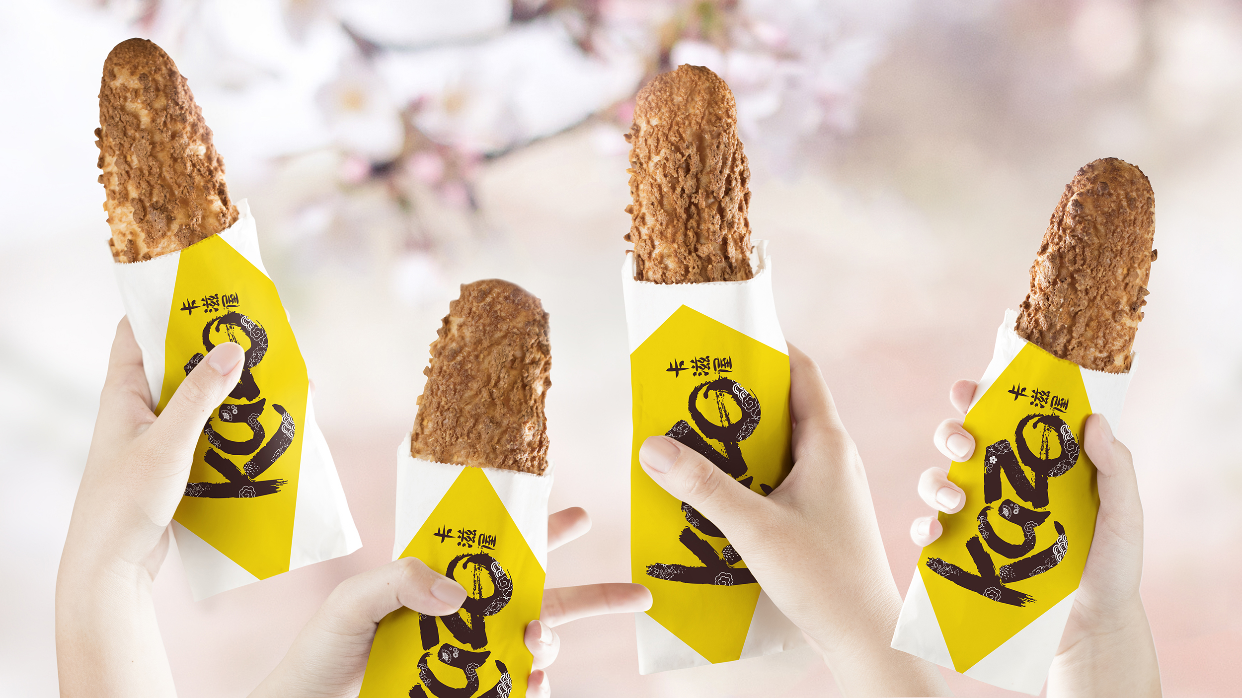
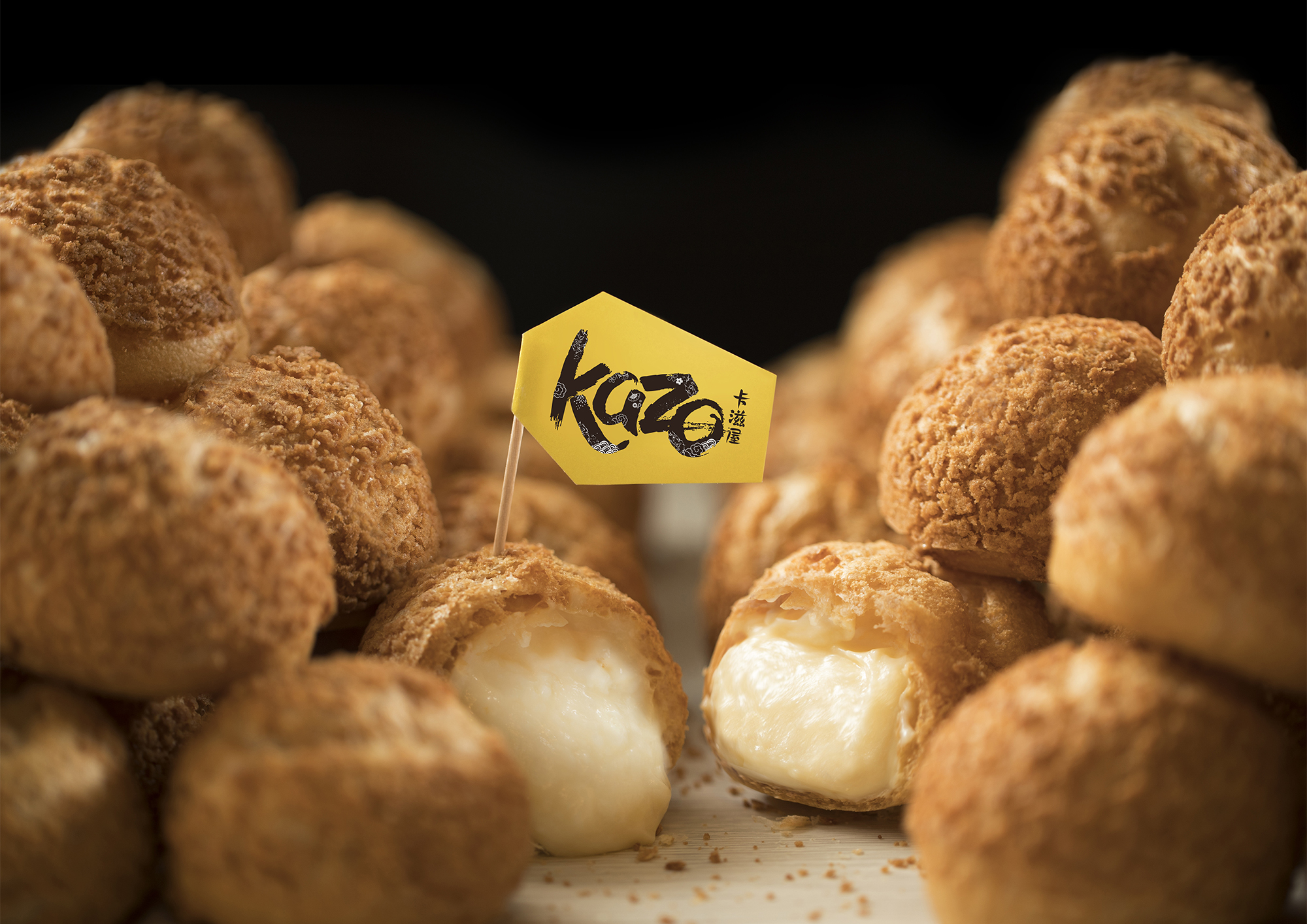
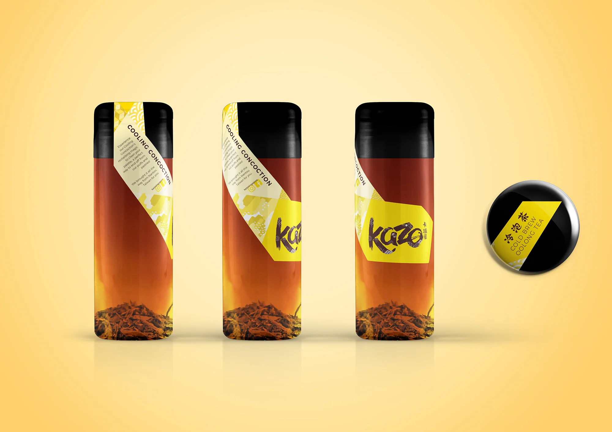
Here’s an incongruous food kiosk in Singapore, whose cream puffs are ready to redefine the profiterole perception on our sunny island. KAZO is shelled with a spunky modern personality, and then fully stuffed with Japanese goodness. When paired conjointly with their puffs, this enclave in Chinatown is sure to pack a punch.
Logo Proposals
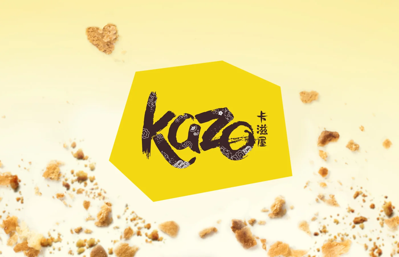
Design 1 (Selected by Client)
The original idea was to add a Japanese word ‘Kazo’ on the right, but the client preferred it in Chinese. Still, calligraphy gave the authentic Asian feel the brand evokes, with modernised patterns inside it to anchor this brand to Japanese roots. The yellow geometric background, soon to become the brand’s most prominent element, allows for a versatile application that falls in line with Kazo’s dynamic attitude.
Design 2
Although sporting the same geometric yellow background, this logo's typography is strikingly modern, as inspired from the geometry of Japanese typography.
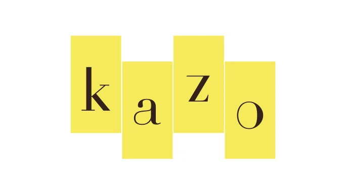
Design 3
A hybrid of sans-serif and serif strikes a contrast between traditional zen and modern minimalism in this sleek and simple logo.
