

Mayson Bakery
Client: Mayson Bakery
Job Scope: Rebranding, Store Identity
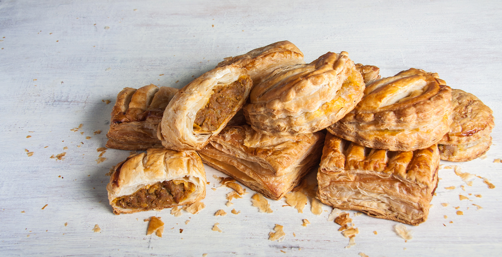
As one of the earliest established bakery brand in Singapore, Mayson has its heritage built on the commitment to bring quality innovative products to consumers with its wide range varieties. Their miniature local treats are easy on the palette, allowing customers to try a greater variety before their fill. Without a firm identity in mind, it was up to us to pave a road for their brand direction to go.
1980's Soul, 2016's Style
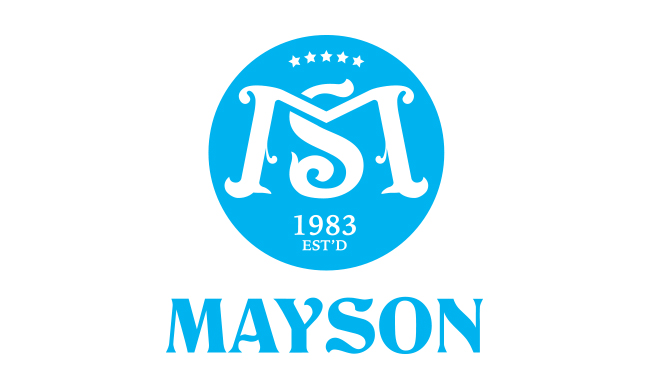
It is not an exaggeration to say that everything about Mayson was in the 80's, including their logo. The experience they accumulated was excellent, but it was high time to let their outdated identity go. The new identity refreshed them with a vibrant splash of yellow, ready to take on the market.
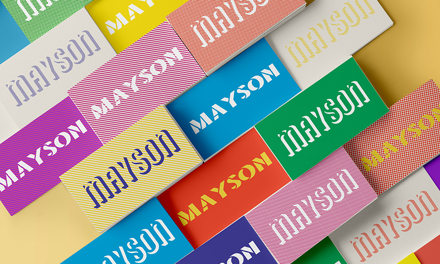
Logo Proposals

Design 1 (Selected by Client)
Inspired by the boldness from the 80's, we bring Mayson back to their roots in 1983 with a loud, but simple wordmark. This was a daring step away from their previously cursive logo. The simplicity and sturdiness of this new logo sends an unabashed message of a loud and proud bakery, ready to take over the market.
Design 2
It is well due to their dab hand in the kitchen that kneaded dough into a firm yet buoyant shape of their initial, expressing their bakers' heart and craft inside a free-spirited 'M'.
Design 3
This logo dramatically elevates Mayson's original logo into a French-inspired symbol, breathing in the rich atmosphere of the world's bakery capitol into their brand.

Design 4
A monogram inspired by the prideful donning of loyalty badges, this logo gives customers a sense of belonging by making them feel as if Mayson is part of a welcoming community of sweet treats.
Typography and Pattern Study
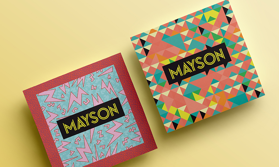
Before arriving at the final logo and graphic elements, we explored several logotypes, colour palettes, and patterns that gave off a similar 80's vibe.
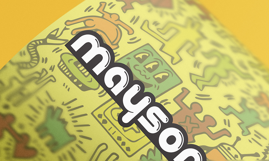
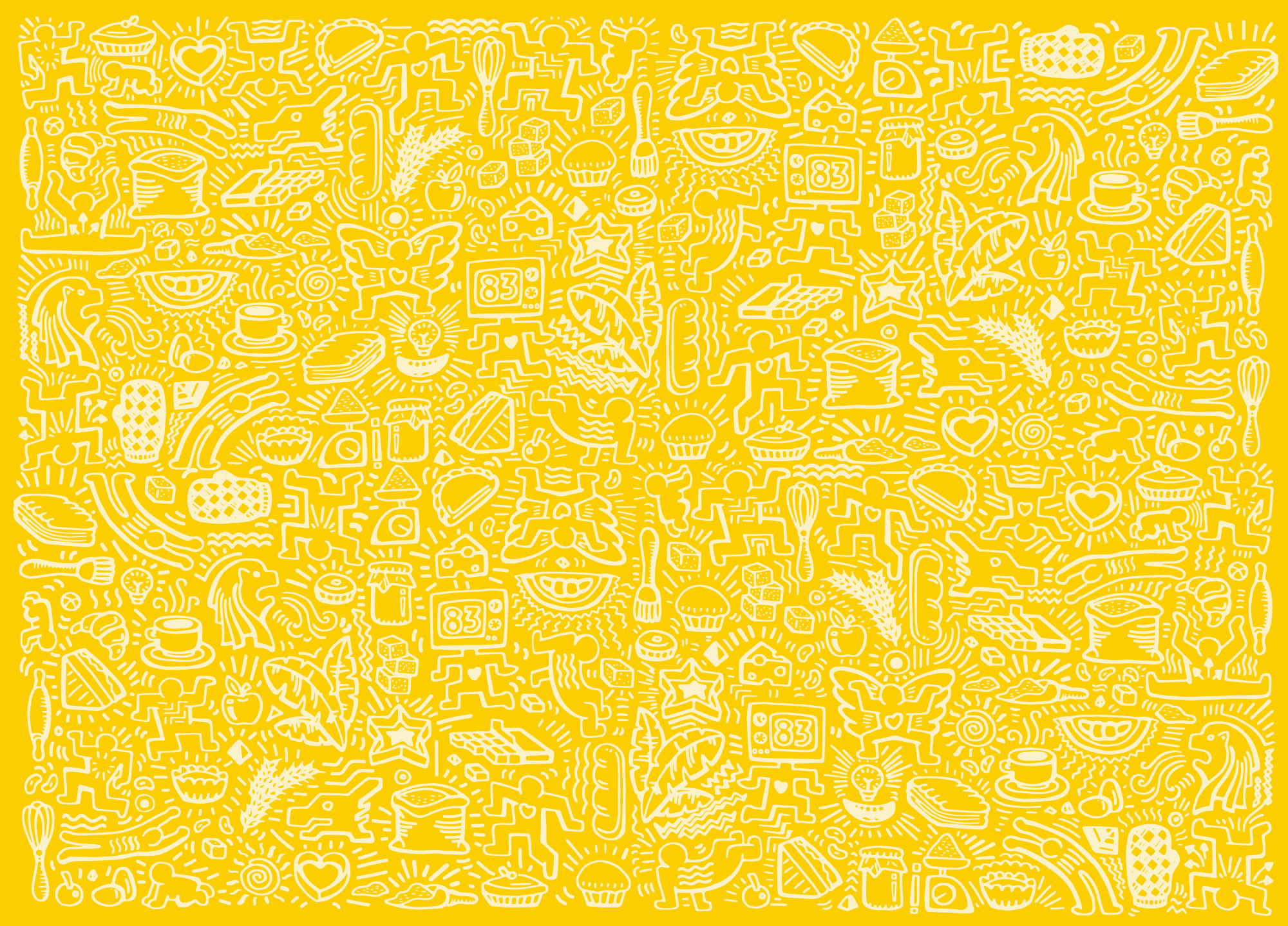
Allure of Nostalgia
There is a commonplace longing for the good old days. Inspired the Keith Haring artistic movement, the illustration captures the spirit of the 80s, the decade when Mayson was established. The jumble of drawings depict Singaporean icons and Mayson-related items. The bright yellow welcomes customers with open arms, while the nostalgic illustration etch Mayson into their minds.
Summary Block