Wing Joo Loong
Client: Wing Joo Loong
Job Scope: Rebranding, Packaging Design
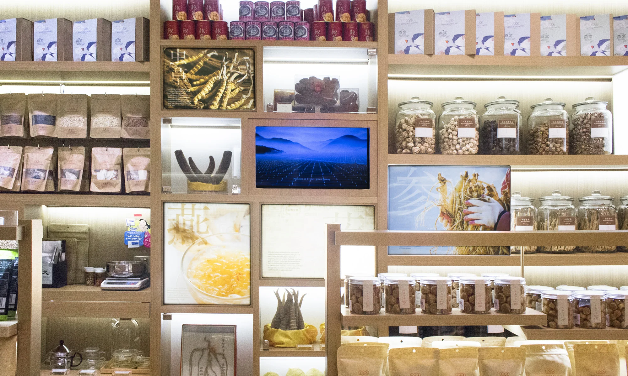
Wing Joo Loong is a Traditional Chinese Medicine (TCM) company known for empowering individuals to lead healthy lifestyles with the finest natural health and wellness supplements and herbs. Since their in inception in 1947, they have remained behind the scenes as a TCM distributor until they noticed the decline in TCM customers over the years. There was no way they'd let it slide. By means of their decades of experience, Wing Joo Loong took up the mantle of a TCM retail shop to directly communicate with their customers. Their mission? To bring TCM back up to its former glory, and then even higher.
Contemporary Classic
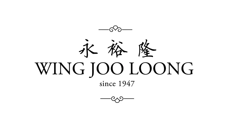
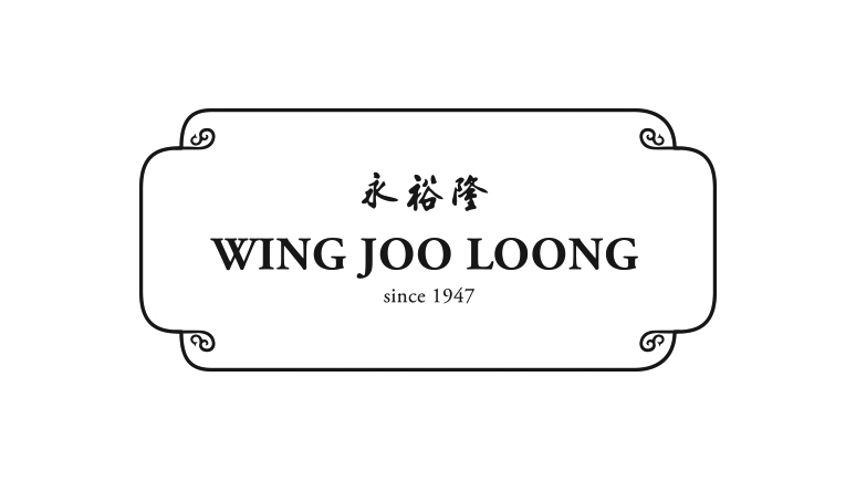
Putting their traditional Chinese writing behind them, Wing Joo Loong's typography drastically shifted into a modern serif, prioritising English over Chinese to target the younger generation. Bringing forth their immense knowledge pool to our millennials, Wing Joo Loong did not neglect their past, but rather, embraced it with the minimalist three circles on top, which were inspired from traditional Chinese signages.
Logo Proposals
Design 1
Design 2
Design 3
Design 4
A Walk Down Memory Lane
Apart from their claim of unparalled experience since 1947, there wasn't any more proof to their title, as Wing Joo Loong had always remained a TCM distributer till now.
These traditional Chinese posters flooded Singapore's corridors back when she was still a mudflat. Although previously a nuisance, these advertisements now walk today's customers down the very same corridor, but now are glorified as art. Nostalgic art.
These precious artifacts not only breathe rich history into Wing Joo Loong's identity, but also affirms their customers of their deep roots.


