


Colada Cookies
Client: Shoon Fatt Biscuits
Job Scope: Brand Naming, Brand Identity, Packaging Design
With a goal of expanding their current biscuit line to the rest of the region, Shoon Fatt has their eyes set on China's growing lucrative biscuit market. This traditional western snack has seen a steady growth in the eastern market due to a changing taste preference of the younger Chinese. Adding healthier ingredients to their signature recipes, this Malaysian company seeks to use their new line of butter cookies and sandwich biscuits to springboard themselves into the dense Chinese market.
Brand Name Proposals
Although originating from Asia, the brand name had to sound European to appeal to the rest of the region as a higher quality biscuit, as that was where the crunchy snack originated from. As Chinese made up a substantial percentage of the target audience, there should be a catchy Chinese to match as well.
- Canapé 康乐比
A type of bite-sized treat traditionally made with a small bread base and topping. Modern canapés' bases may vary. A canapé may also be referred to as finger food, highlighting the biscuits' convenience factor. Chinese name suggests “joy and healthy biscuits”
- Sobroso 食宝酥
Meaning tasty or lovely in Spanish, this name is an expressive adjective for the biscuits' taste. Chinese name means “precious crispy bites”.
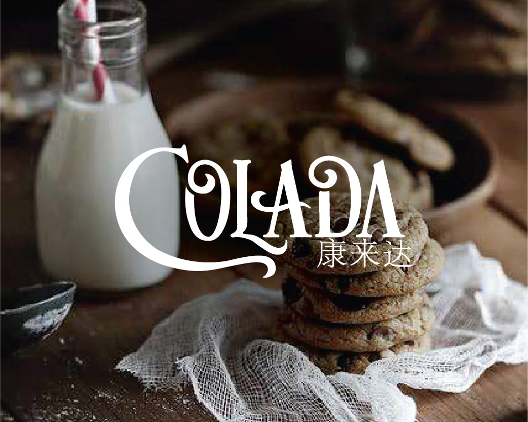
- Colada 口乐达
Inspired from 'pina colada', the pineapple coconut rum drink. We are not associating with the drink but the exotic european feel. Chinese name depicts “enjoyment of taste”
- PiqNiq 必密
A homonym for the English word 'picnic', this name connotes the same light-hearted joyous meal that a picnic would provide. The 'Q's at the end give it a mysterious twist, suggesting a secret must-try recipe. Chinese name means "an essential" must try.
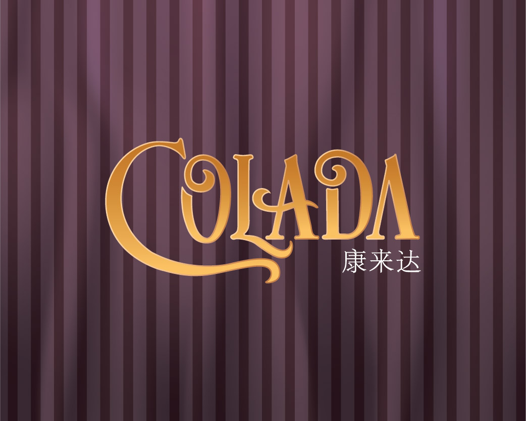
Logo Design Proposals
Primarily using typography to exude the European feel, all the logos bring the audience back to the time biscuits were created. The premium look of the brand is enhanced by the gold.
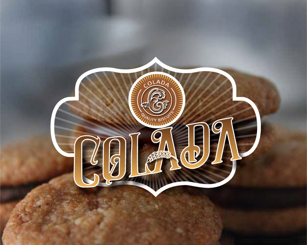
Design 1 (selected by client)
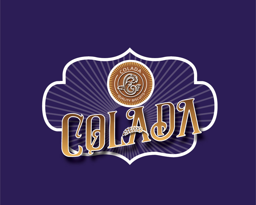
Design 2
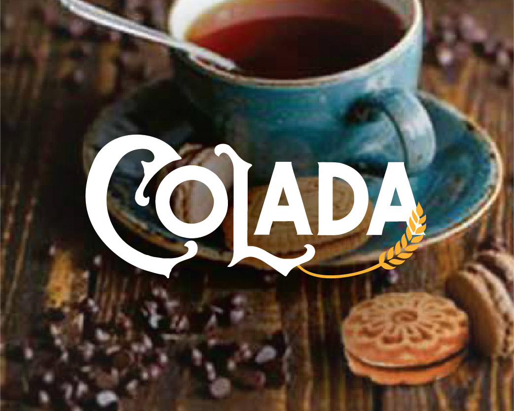
Design 3
Market Study
Before we jump into designing, it is important to study the market the product is going in. We went around China's biggest stores, and even online, to get insights on our competition.
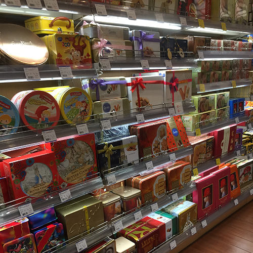
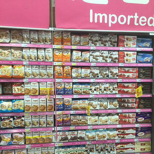
Retail Food Stores
We studied hypermarkets, supermarkets, and grocery stores of all tiers and found one thing in common- they are all densely packed with biscuits.
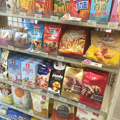
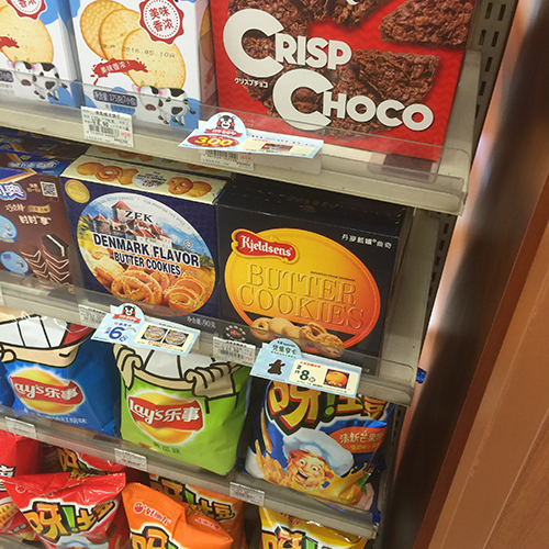
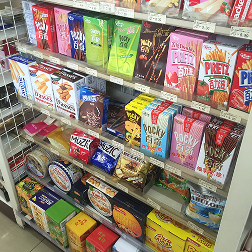
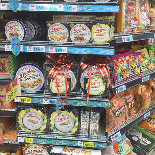
Convenience Stores
Much less crowd than the retail food stores, convenience stores stock only the smaller packaging sizes. That means only the best brands get a spot on the shelves.

Online
China's newest shopping avenue, where customers need not be local to get their hands on this biscuits. Unlike a physical packaging, the product is only limited to flat pictures.
Harmony Against Noise
There were many beautiful packagings on the shelves, but together, they just created noise. Colada needed rocket power to penetrate such a saturated atmosphere.
After much scrutiny, we realised that the way to quell all this noise was with the serenity of a mood shot. The beauty of mood photos was that they could evoke the emotion of a time and place while not being too noisy. And the best part- none of the competitors had mood photos.
The answer was clear- mood photos were the way to go. Perfect for conveying the European look as well as standing out from the crowd.

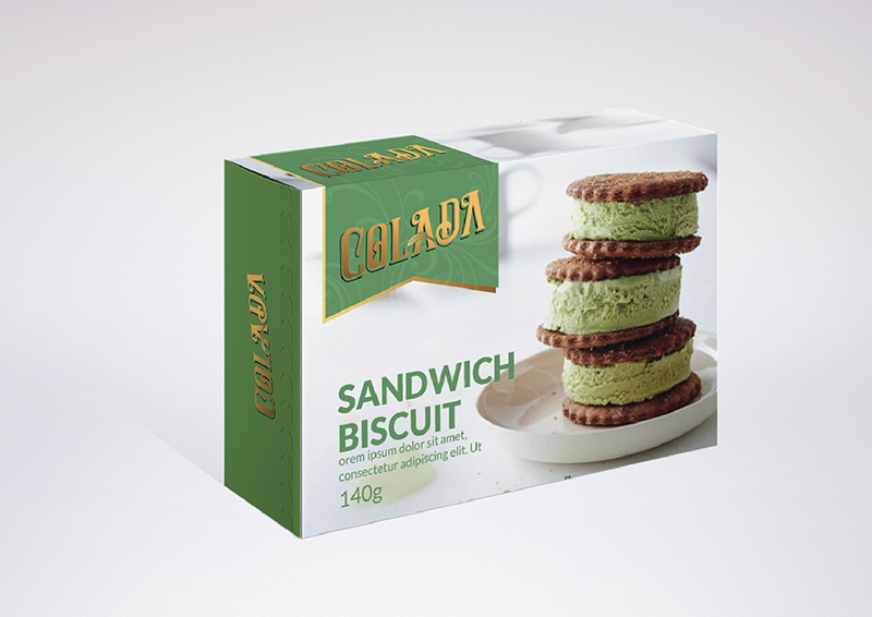
Packaging Design Proposals
Several design concepts pivoting around a mood shot. Mock mood images were used before the photoshoot.

Photoshoot
After confirmation from the client, a photoshoot was arranged for their actual biscuits
(BTS of photoshoot here)
(final photos here)
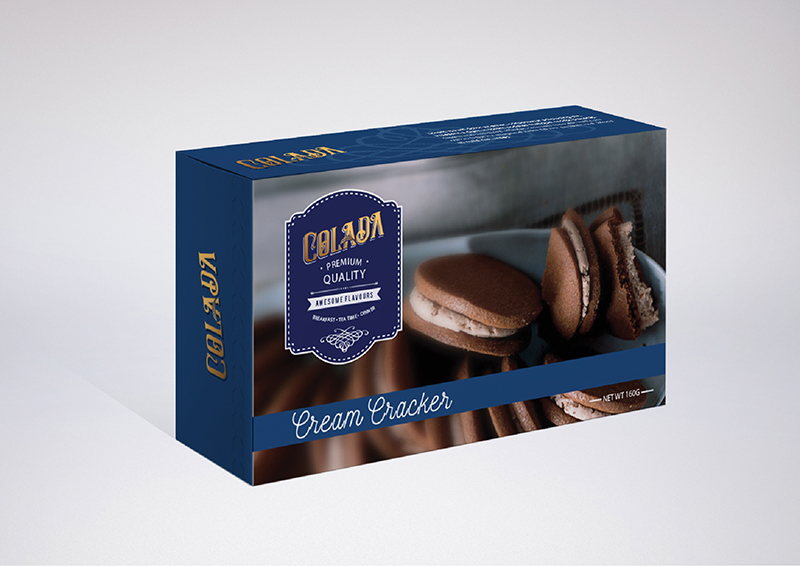
Final Design
(photos of final)
Buttery Blues
Biscuits and cookies weren't the only snacks in Colada's range. The next task was a packaging design for another classic treat- butter cookies; that signature dark blue flat cylindrical tin of cookies that stock up a row on the store shelves. But why blue? Producing a blue can in a sea of other blue cans seems like a good way to dig our own grave; there are tons of ways to design a tin can after all.
The same dark blue could make Colada look like a dime in a dozen, but swaying from it would make them look like an imitation. Many, if not every, established butter cookie brand was already dark blue; a divergent would lose its crediblity as an 'authentic' butter cookie.
But we weren't going to throw in the towel. In this limitation layed a tougher challenge- making a dark blue can stand out among its fellow blue relatives. Bona fide blue it is.

Packaging Design Proposals

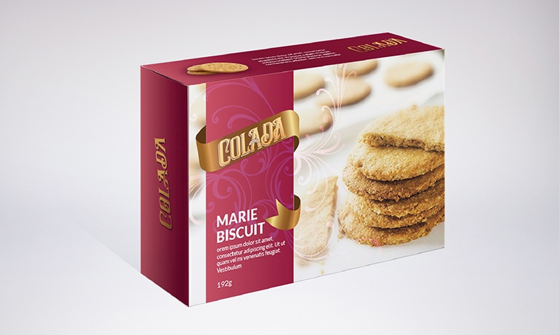
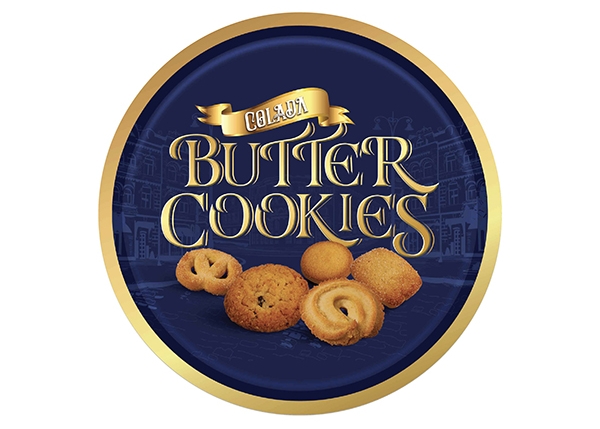
Design 1 (replace with actual photo)
A colour of prosperity and good luck in Chinese, the splash of red targets Colada's primary market, China. Associated with such positive energy, the Chinese often give gifts coloured in red during festive seasons, making Colada's butter cookies apt for its target market.
Design 2
Danish streets as the background, as that is the place of butter cookies' origin.
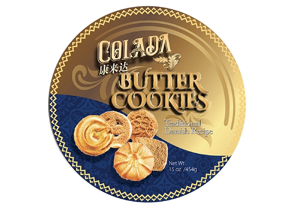
Design 3
A cut of gold against a subtle Danish patterning, to represent premium Danish quality.

Design 4
A more generic and amicable approach.